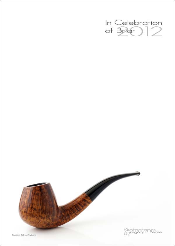
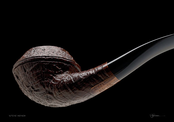
A Preview of the Photographs
from the new
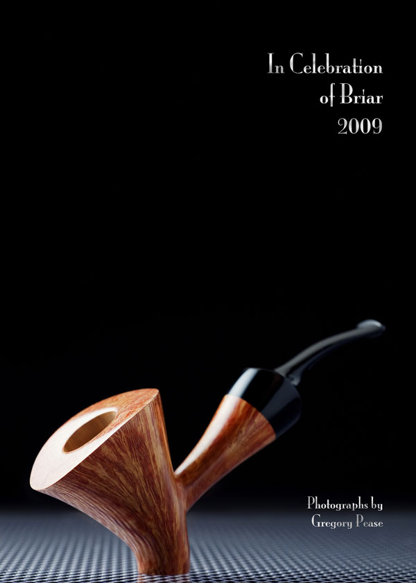
2012 Calendar,
“In Celebration of Briar”
from the new
2012 Calendar, “In Celebration of Briar”
|
In Celebration of Briar - 2012 is published on demand and distributed by Lulu Press. It is printed on heavy-weight, coated stock, and is 13.5" x 19", spiral bound at the top. Interior photos are high resolution, 13.5" x 9.5", and show amazing detail. This is as close as you can get to individually custom printed images without the high cost. Lulu prints in several countries, and ships world-wide, so the calendar is available everywhere, without high shipping costs. The price is $35. Click the link below to purchase a copy. Previous editions are also still available, and can be ordered here, for those who may want to collect the set. |
|
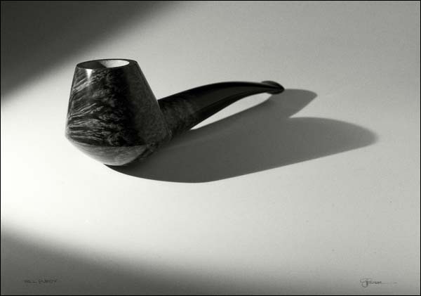
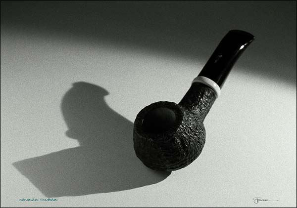
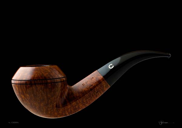
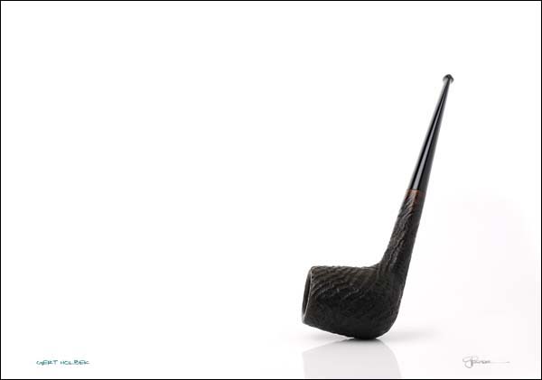
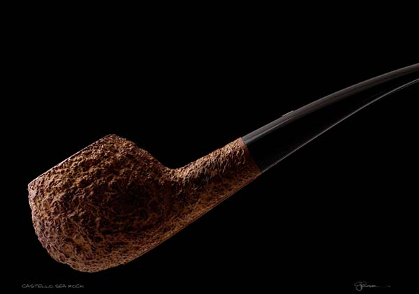
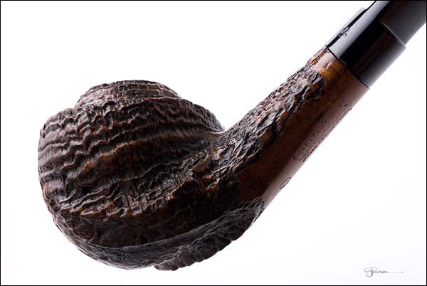
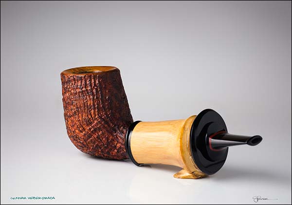
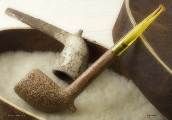
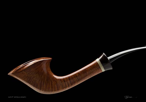
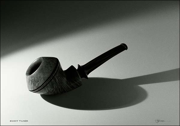
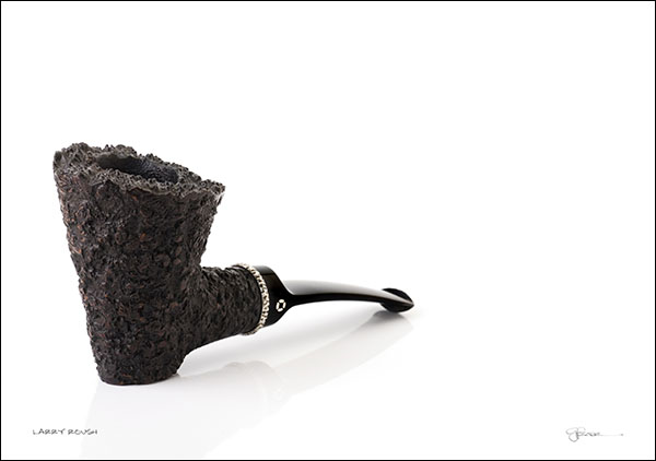
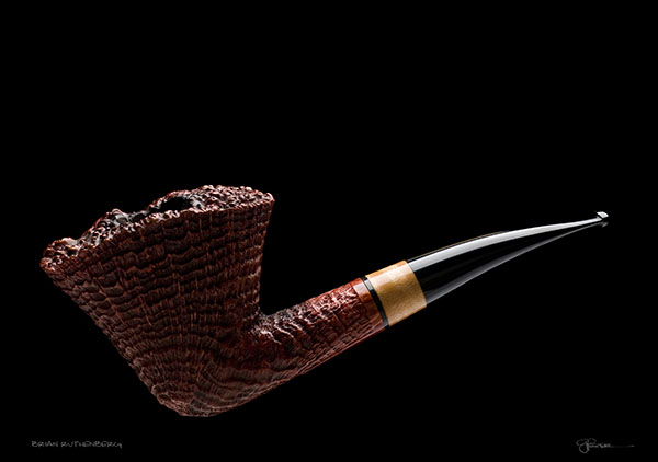
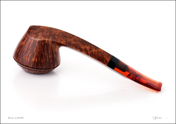
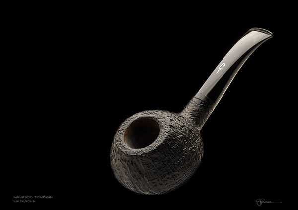
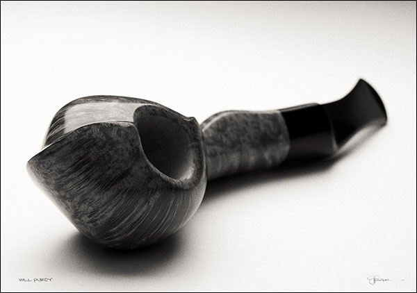
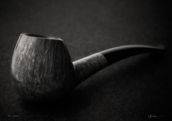
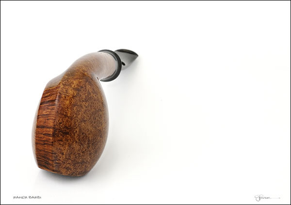
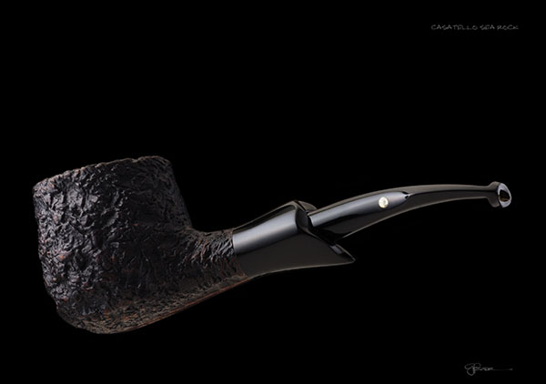
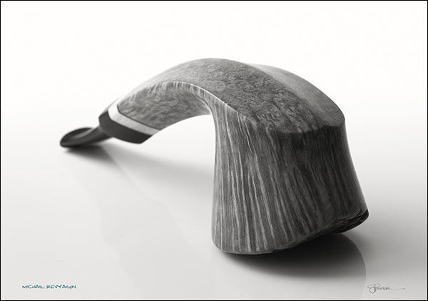
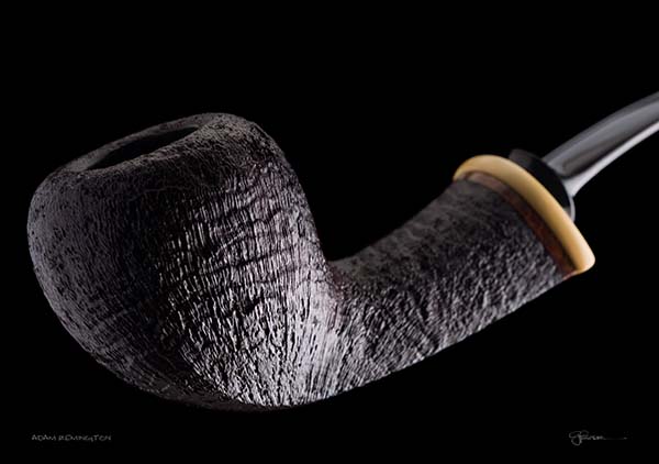
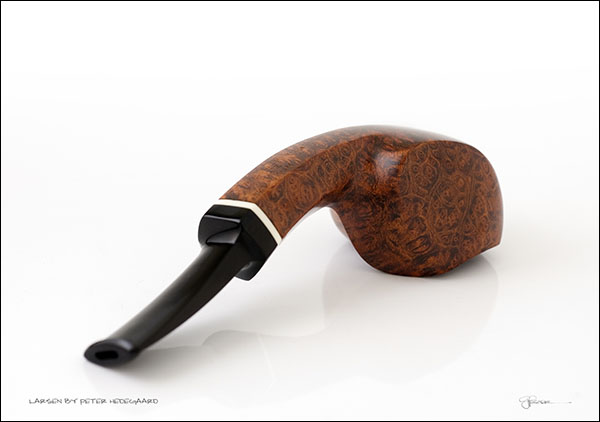
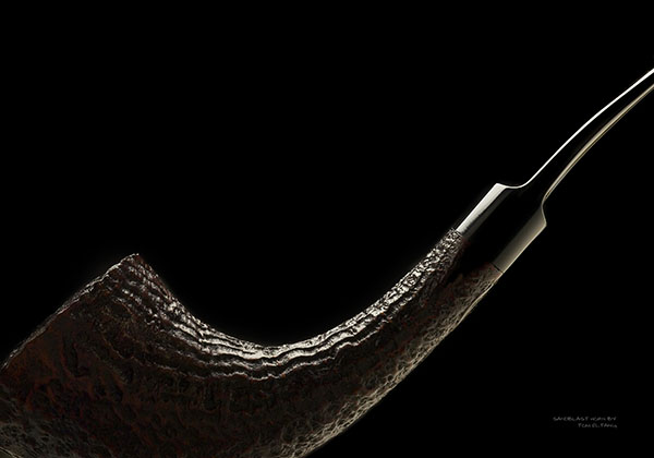
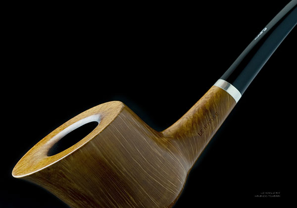
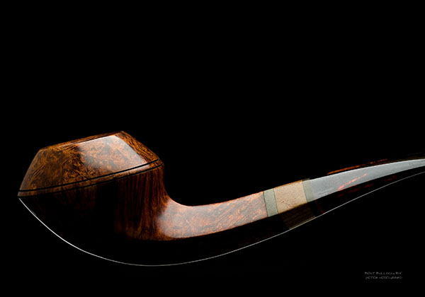
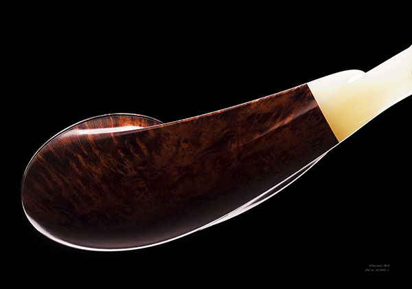
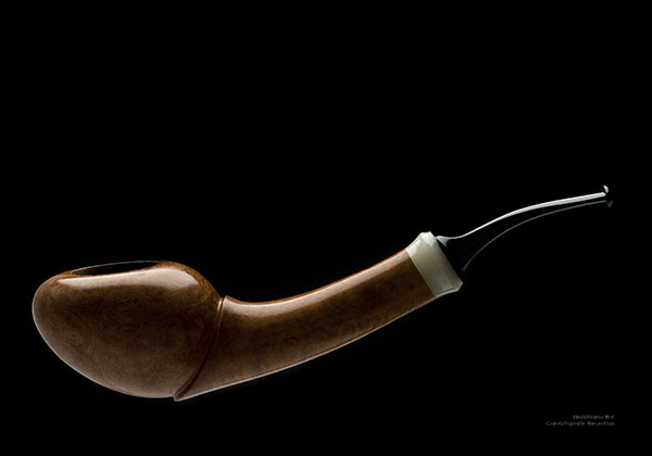
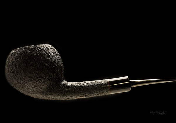
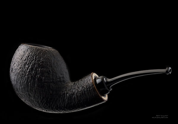
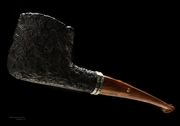
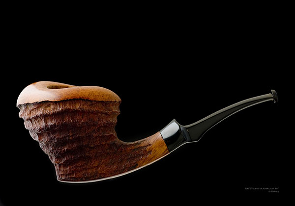
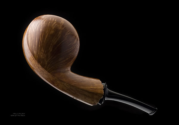
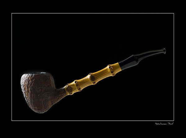
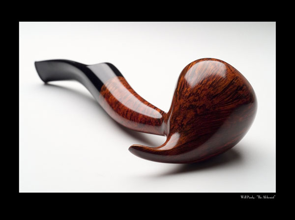
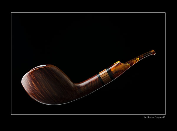
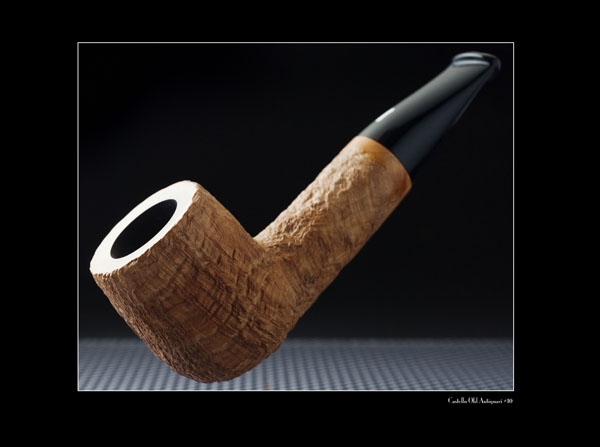
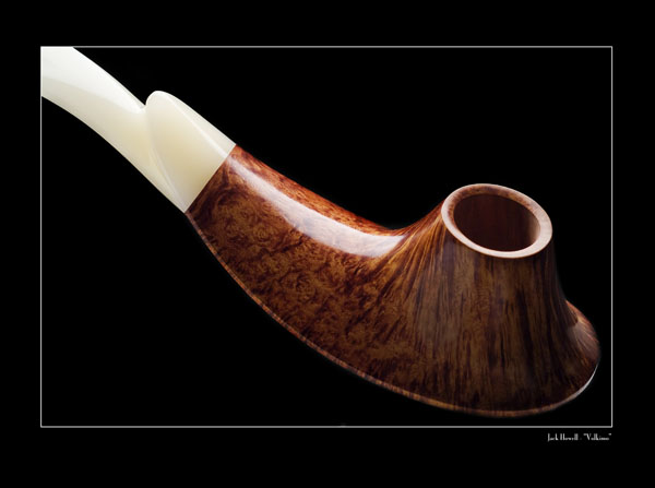
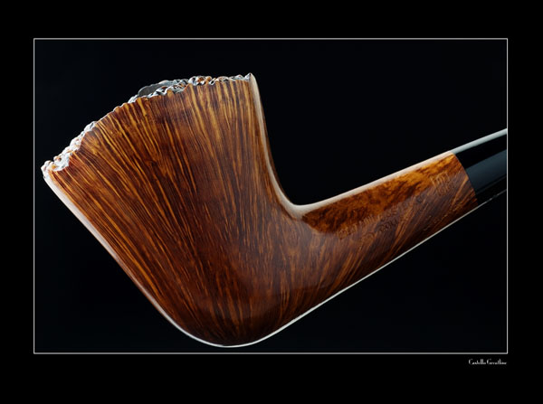
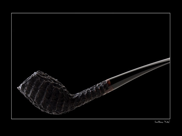
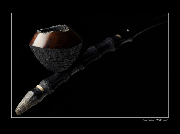
I love B&W photography, and have traditionally been far more comfortable working in that mode, having been in the darkroom (and, some would say, in the dark) since I was about 8-years old. The first work in this project, though digitally shot, was therefore done in monochrome, which is reflected in the first two editions of the calendar. Adding the more literal nature of colour created some different and interesting challenges for me. I'd done some commercial work in colour in years past, but my personal work, which I consider this project to be an extension of, was always done in B&W. Colour was something I enthusiastically embraced, though it seemed important to retain some of the drama and relevence of the monochrome work, whilst also capturing the wonderful and varied hues of the materials and stains. In some cases, like Adam Davidson's remarkable Witch's Finger from 2009, at least at first glance, there's almost a monochromic feel to the images, but then, the more subtle, dark colours reveal themselves from the shadows. In others, the colours are vibrant, as with the beautiful synthetic amber mouthpiece of Peter Heeschen's signature pipe and the copper swirled acrylic on the Castello 55. Each expressive mode has its place, and it's been increasingly exciting to explore both. I've gotten a little more comfortable, finally, working in colour, but B&W is still my first love, and as this project continues to grow, I feel myself being pulled back in that direction with some urgency. Time will tell. In every case, it's my goal to have the photos reflect something of the personalities of the pipes they depict, just as the pipes reflect something of their makers. Every pipe is unique, and so must be every photograph. Some of the pieces lent themselves to more conservative, literal rendering; others asked for a more interpretive, abstract approach. I've always presumed to think of the images in this portfolio more as portraits of pipes than as documentary evidence of the space they occupy in the world. Each has its own identity, and that's what my lens is seeking as it finds itself turned in the direction of the little briar artworks that we love so much. Sometimes it comes quickly, other times, hours can be spent looking before the image is revealed. There's one paricular pipe in my collection that, despite many attempts over the 10 years I've owned it, defies being "seen" in two dimensions. One of these days, I'll get it. TOP |
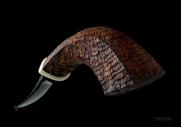
Here are the Images
from the
2011 Calendar
from the
2011 Calendar

Here are the Photographs
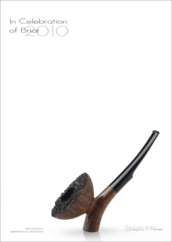
from the
2010 Edition
from the
2010 Edition

Photographs
from the
2009 Edition
from the
2009 Edition

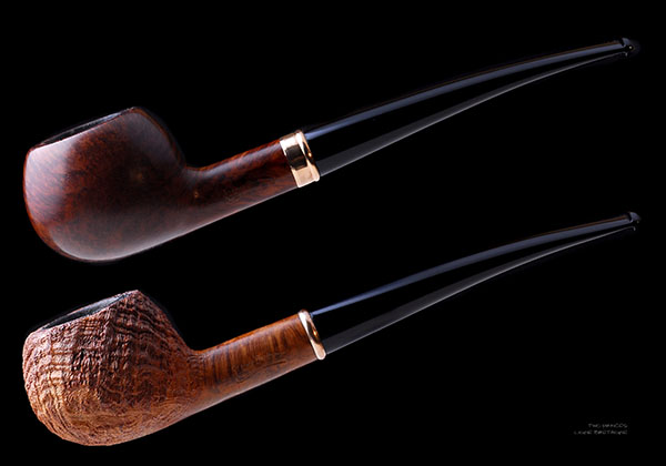
And, some of the Photographs
from the
2008 Edition
from the
2008 Edition
Cover and Composite
from the
Premier 2007 Edition
from the
Premier 2007 Edition
|
The photos have all been taking using, at first, a Fuji S2 Pro, and more recently, a Nikon D200, usually through the exquisite Micro-Nikkor 60mm/2.8, or, in some cases, a LensBaby Composer 2.0, which is a blast to play with. Lighting is either from a single medium soft box, or from a single projector spot as key light. The fill is supplied by countless reflectors, little bits of silver foil, small strips of white card to add light, and black cards to subtract it. The setup and lighting alone can take anywhere from a few minutes to hours, but you only get out of the process what you put into it. I don't rely on Photoshop "tricks" to realize what I have in mind when I start, operating, still, as a photographer, not a digital artist. My stubborn, mud-stick philosophy is that if I can't do it in camera or in a wet darkroom, I don't want to do it on the screen. Perhaps it's limiting, in some sense, but it's truer to my vision, and to my personal photographic ideals, to work as I did when film and large format cameras were my tools of choice for tabletop photography. Others see the process differently. I do love the creative freedom that digital imaging affords me with things like the ability to control contrast and colour adjustments, and to do the inevitable dust retouching. It used to take hours at the spotting table with my little palette of colours and tiny 000 brushes, magnifying loupe strapped to my head, getting rid of the inevitable dust specs, then repeating the process for every print (not to mention the retouching knife on film). Now, I can do it once, and it's done forever. Though there is some comfort in knowing that every print will be identical, now, there was something sort of romantic in knowing that each silver print I made in the darkroom would be slightly different from those that came before it. It's a concession I reluctantly made, at first, but have come to really appreciate. Though silver replaced silicon for me nearly 14 years ago, exploring this "new medium" continues to be a fascinating journey. It's been a great joy and a fascinating journey bringing another year's calendar together. The ovreall body of work has taken some interesting twists and turns since I started working on it in 2005. I'm looking forward to see where the project leads in coming years. TOP“Your calendar arrived here the day after christmas, in perfect time for the new year. It has found a place in my office, opposite of my desk. Every day of the rest of this year, I'll have a glorious pipe photo before my eyes. I like it a lot, and if you should decide to have a calendar for 2008 I'll be buying.” -MR (Germany) “The calendar arrived and it is magnificent; not even the pictures on the web do it justice.” -TB (USA) “CALENDAR ARRIVED! WOW!!! I had no idea it was so large or so classy - in person it's 10x better than the pictures convey....honestly!” -LH (USA) “I've finished my previous message in hurry forgetting to write you my compliments for your calendar: wonderful pipes and wonderful photos. I sincerely think you're not only a great tobacconist and collector but a passionate animator of the pipe-world as well.” -MT (Italy) “Well, now, this is interesting... my reaction surprised even me. After 30 years of pipelife, I figured (assumed is a better word) there was little in it that I hadn't seen. It is, after all, a pretty well-defined domain. Then I looked through your pics and was amazed. The perspective shift was alarming. (Meaning in a pleasant way.) If these have been on your site all this time, I missed them somehow, but that's good I guess because of the surprise factor of seeing them all at once. VERY nice, GL. The technique, composition, and subject are all first rate, and the overall resuting interpretation is arresting. (My nephew in KC is a pro photog who does the art thing on the side, and I've been to MANY shows and exhibits... that "arresting" thing is the hardest of all to achieve, IMO.)” -GD (USA) “The calendar arrived today, it¥s much larger than I figured, I never converted the inch measurements. It¥s very nice photos! And two with Bengt pipes! It¥s already hanging on the wall. One thing I wonder why U.S start the week with Sunday?? Doesn¥t make sense to me and U.S being such a religious country too! Do they start the week with rest???” -PB (Sweden) TOP |